As is fated to occur a few times every year, someone recently posted on Reddit about their Hot New Upscaling Algorithm. Normally, I see posts like this and just ignore them, but this time around a few factors convinced me that more detailed commentary would be valuable:
- Quite a few people linked me the repository asking my opinion. A writeup like this prevents me from having to repeat myself a dozen times.
- The repository appears to have received quite a bit of positive feedback on Reddit and other social media, yet I haven’t seen any good criticism of its numerous shortcomings. I think there’s a broad audience that could learn a lot from this.
- The creator of Anime4K proffered numerous lofty claims that did not hold up. It doesn’t help that I was in a bad mood while reading them.
- This paper’s issues are relatively common ones, so a writeup like this offers some ways to critically evaluate the next one of these to blow up on social media.
The paper begins by introducing a “state-of-the-art”, “high quality” upscaling algorithm. A claim like that should be backed up by a rigorous, fair comparison against existing options, which definitely did not happen here. Unfortunately, there’s a larger issue at play.
Anime4K is not an upscaling algorithm.
If you read even a bit of the paper, it becomes abundantly clear that this filter does not actually change the resolution of the video. It is a sharpening filter. It is designed to take an image and sharpen the lineart. That’s it. Making a sharpening filter is fine, but please, call it what it is.
Armed with just this knowledge, you can figure out that some of the paper’s other claims are pretty deceptive. A quick google search makes clear that there are numerous other sharpening filters in existence with similar techniques and output. The paper does not discuss this, and instead spends most of its time comparing apples to oranges. Likewise, when it talks about how fast the filter is – well duh! Lots of similar sharpening filters are plenty fast too. I’m glad it works in real-time, but this isn’t some revolutionary new technology. The obvious comparison is with WarpSharp, an old GIMP filter later ported to VirtualDub and Avisynth, that works similarly and was very popular among new encoders for a long time. The encoder community mostly outgrew it with time, but I guess we’ve come full circle.
So how did the author actually produce the upscaled images used for the comparisons? Well, he used a different upscaling algorithm (Jinc) and then applied Anime4K on top. Chaining filters together is totally normal, so long as you make this clear. When initially published, the author didn’t even feel the need to mention the use of Jinc in the comparisons at all, leading to confusion over where output images actually came from.
Ideally, the comparisons would include a variety of other sharpening filters and discuss the tradeoffs between them. This obviously didn’t happen. We’ll mostly proceed under the assumption that he’s actually talking about Jinc + his filter throughout the paper.
The issues with the comparisons lie deeper than that though. A comparison between different filters is a discussion of tradeoffs. There is no free lunch. In particular, with upscaling you are trying to recreate information that was lost or never present in the first place. There is no magical way to do this perfectly, and instead a variety of different approaches with different speeds, characteristics, and resulting artifacts. In particular, sharpening filters often result in detail loss, warped lineart, and a ‘watercolor effect’. Beyond a brief mention of overshoot, the author of this paper seems singularly concerned with the sharpness of the lineart and damn everything else.
His reasoning for this, judging by comments on social media, seems to be that other forms of artifacting are not visible on 4K displays and that particular resolution is the singular focus of his filter. There’s nothing really special about Anime4K that precludes comparison at other resolutions, particularly if you consider that it’s just a sharpener, but the idea that aliasing is somehow invisible on 4K displays is laughable. They have higher pixel density, but even on a “retina display” you can still see artifacting despite an inability to discern individual pixels. The author’s focus on 4K is just an attempt to deflect legitimate criticism.
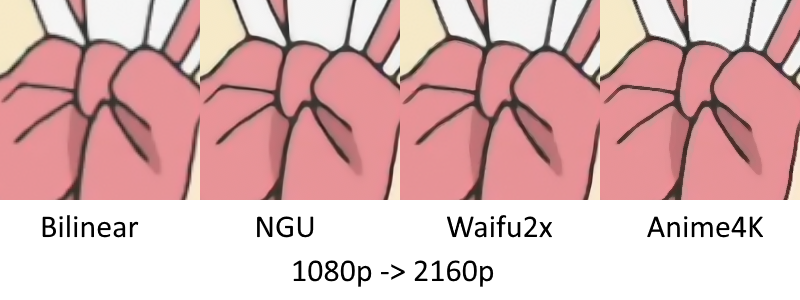
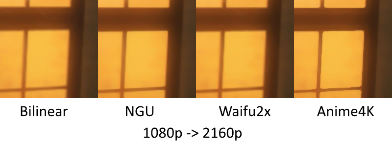
Below I’ve put two of the author’s provided comparisons to illustrate some of the issues with his filter. If you don’t see any difference between the options below, instead of sending me emails please make an appointment with your local optician. :-)
You can tell fairly quickly that the Anime4K option is indeed quite sharp, which I suppose is why the author considers it to be the best. However, it also produces significant aliasing, which is the jagged edges along the lineart. Additionally, even without the source image present, I think it’s fairly clear that this filter is thinning/warping some of the lineart significantly, which is also a downside. A reddit commentator compared it to QTEC, which is more or less accurate.

This comparison is a little more bizarre. Again, you have added aliasing and thinned/warped lineart, but you also have banding along the windowsill amplified in what appears to be an attempt to sharpen it. I think it goes without saying that this is not a positive effect.

I checked on some other images with more detail and the loss is pretty substantial. It’s not like most anime is 100% large swaths of completely flat colors, so these comparisons are about as good as you get. If you like really sharp images when upscaling, just use NGU and call it a day; it looks much better and runs in real-time just fine.
“But wait!” cries the voice in your head. “Isn’t his filter applied on top of Jinc? Why don’t I see Jinc in these comparisons?!”
Great question, voice in your head! Indeed, it is quite strange that the author opted not to include just plain ol’ Jinc here, especially when he did bother to include bilinear, an extremely fast but blurry algorithm, and xBR, a pixel art algorithm. The more cynical among us might say this is an attempt to conflate the results of his filter with those of just Jinc.
He claims in the paper that his comparisons were “randomly selected”, something I highly doubt is true. Randomly selecting frames from videos will almost never produce an interesting selection that shows the tradeoffs present in various algorithms. Additionally, it is very, very tempting to choose images that make your algorithm look better than it would in a 3rd party comparison, even if this isn’t done consciously. A quick glance against some other sample images I had lying around makes me think that occured here.
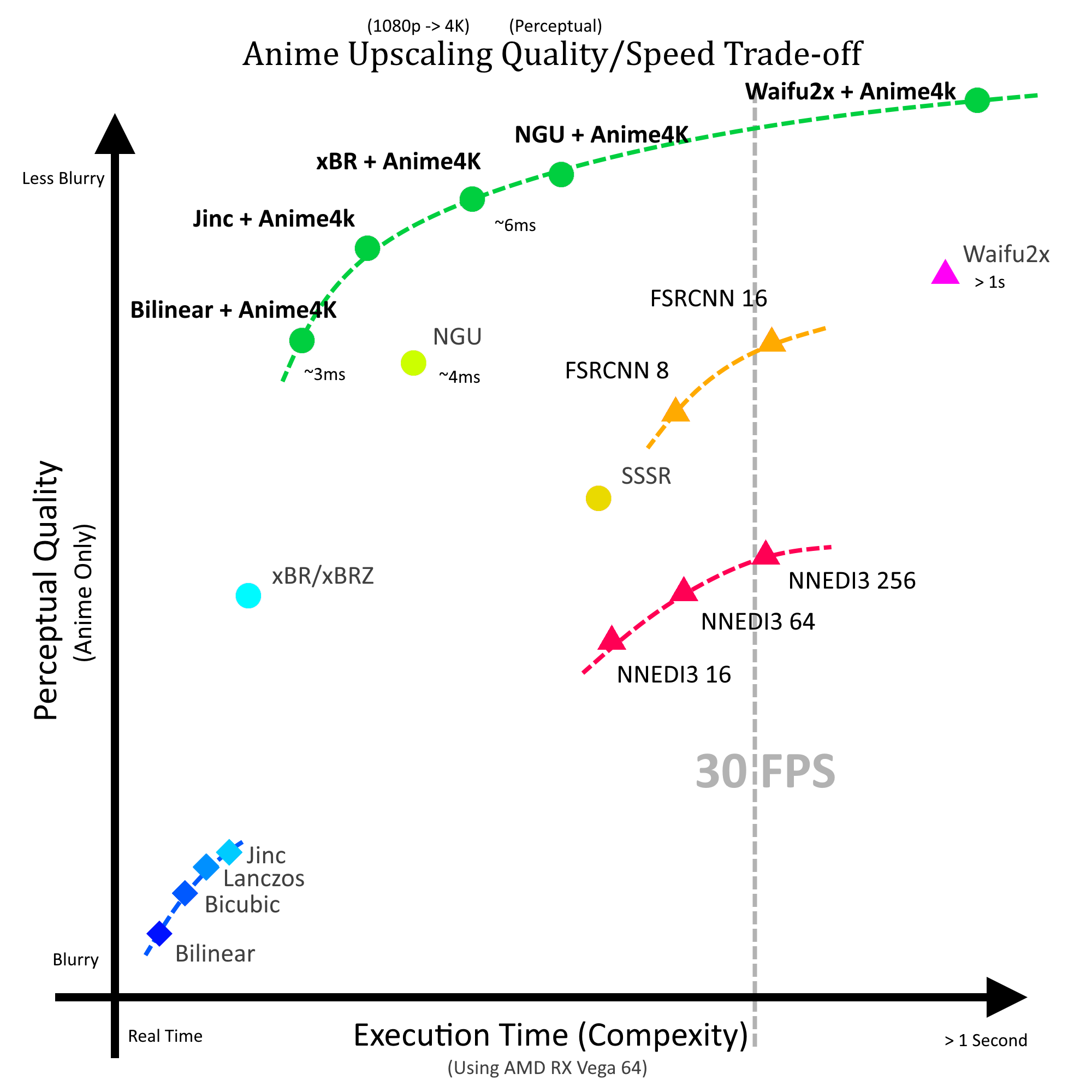
He chooses to use this graph as evidence of his algorithm being state of the art. The “perceptual quality” was apparently just him doing a double blind test with some random people. Most people are grossly unqualified to judge video quality and probably can’t even tell the difference between the three rightmost images in the above comparisons. Most people are also going to say that sharper images look better, regardless of detail loss and other artifacting.1 I can produce some incredibly sharp images that look like shit and get a ton of people who think they look great. That said, subjective quality comparisons have their place, but the graph means very little on its own without detailed info on how the data behind it was collected.

The author dismisses more quantitative metrics (PSNR, SSIM, VMAF, etc.) by saying he is only concerned about upscaling to 4K, and that there are no ground truths at that resolution because no anime is produced at it. As mentioned earlier, the decision to restrict comparisons to only 4K is arbitrary and dumb.
There are other random bizarre factual errors present that aren’t terribly important but nonetheless amusing, my favorite being his claim that no anime is mastered at 1920x1080 except for full-length films. I won’t go through the full list, but their presence is not encouraging.
In short, please try to view self-proclaimed video innovations with a degree of healthy skepticism. More often than not, there’s a lot of marketing and a distinct lack of substance.
Footnote:
-
1: This is admittedly a hard problem. A reasonable comparison is with loudness in audio — people will rate louder samples as sounding better, so if your encoder adds a +0.1 dB boost that can give you can unfair advantage in comparisons. That’s easy to correct for, as you can normalize the max volume, but there’s no similar solution in the video space. Even if you could correct for sharpness, it wouldn’t make all that much sense when comparing sharpening filters. ↩